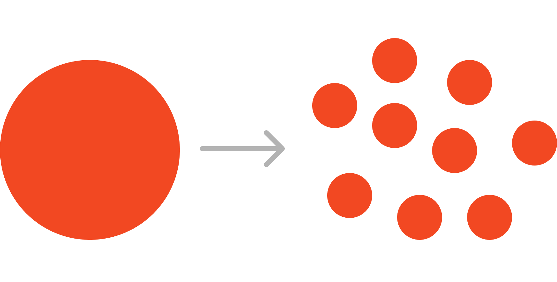
We created a set of components to cover our basic needs. As a result, our new designs took significantly less time to create and were aligned across all product teams.
Founded in 2008, Sauce Labs is a leading provider of automated software testing solutions, enabling companies to deliver high-quality web and mobile applications.
The Sauce component library was a mess of inconsistency and design debt. Teams were spending too much time building and too little time innovating.
I took on the task of developing a plan to design and adopt a modern design system and component library, helping product teams deliver solutions more quickly.
Like most startups, Sauce developed solutions quickly and did not devote much time to design standards and processes. Sauce product teams contributed to a component library — a shared set of UI components that enable teams to build solutions quickly. Yet, there were no clear standards from which to make these components. As a result, the Sauce component library became a collection of inconsistencies. It was littered with nearly identical yet slightly different components, colors, styles, and behaviors. Most did not adhere to basic accessibility standards. Moreover, inconsistent component implementation between and within products made it impossible to update UIs easily.
Designers lacked components that met their needs. Their designs were limited to what was available in the library; any new designs would not align with anything else, meaning developers would have to build from scratch. Teams were spending too much time building and too little time innovating.
Without consistent and well-designed components, it was difficult, even painful, for Sauce designers to create basic solutions. They spent disproportionate amounts of time creating essentially one-off solutions. A UI audit made clear that many components and interactions are inconsistent. However, no one team owned the component library; there was no mechanism or process to redesign components, let alone have teams adopt them into their UIs.
I developed the plan for Sauce Labs to design, develop, and ultimately adopt our new design system and component library.
Getting Started
In early 2021, a newly formed Design Team began establishing standard components in Figma. By mid-year, we had created a set of Figma components to cover our basic needs. As a result, our new designs took significantly less time to develop and were aligned across all our product teams. This work demonstrated progress but did not address the underlying issues with our component library. Our nicely designed Figma components did not always make their way into the final product.
As Product Design Manager, I took on the task of developing a plan to design and adopt a modern design system and component library, enabling product teams to deliver quality solutions more quickly.
I gathered my team to brainstorm a basic set of questions: What is the problem we want to solve? Why is this a problem? And for whom? What is the desired outcome? What does ‘done’ look like? And how will we know that we did a good job? The results of these questions became my objective statement.
Objective
We aim to build a design system to enable our product teams to deliver a world-class unified product experience for our users. Our design system will make the quality of our products better for our audiences through:
- Intuitive set of UI components, with consistent behaviors and messaging, on-brand visual design, and full accessibility standards adherence
- All Sauce products use only new components; all old components have been deprecated
- A well-defined system of governance
Desired Outcomes
For our product teams: A well-defined design system allows all Sauce product teams to deliver value to our users quickly and at scale through shared tools, guidelines, and principles. Our product teams can focus on new problems and innovation by resolving everyday, recurring situations with repeatable patterns.
For our customers: If we do a great job of aligning and integrating our products through the use of a well-designed Design System, it will lead to:
- Improved brand perception and product satisfaction
- Reduced cognitive load for our users (less context-switching)
- Fewer support tickets and reduced churn
Users notice when things are designed well. More accurately, users notice when things are designed poorly. Good design is not “extra” or a “product differentiator." Today, it’s what users expect from any application.
Developing a Stakeholder Strategy
Developing our objective was the easy part. The more challenging part was going to be getting other teams on board. Understanding the stakeholders involved — their needs, motivators, states of mind — and methods for reaching them is critical. My team and I drafted a list of stakeholders and our assumptions — Who are the active supporters, skeptics, and opponents? How does our objective benefit each group? What concerns or objections can we expect from each?
For instance, our CPO was concerned that our design system would be overly prescriptive, stifle innovation, and become a burden to maintain—all valid concerns. We focused on the fundamental building blocks, all the shared common elements, and emphasized that not everything needed to be in the library. Product teams are encouraged to experiment with experiences without worrying about building components.
In addition, we assessed each stakeholder regarding the amount of direct involvement and influence they will have regarding our objective.
Understanding our stakeholders was by no means a linear process. However, eventually, I gained a clear understanding of what it would take to address stakeholder concerns and with whom I needed to continue building trust and alignment.
A Thorough Component Audit
My team and I thoroughly audited the Sauce application platform for all existing components and interactions that should be components but were not. We then prioritized components with the broadest use and those essential for key use cases, which enabled us to define the scope of our project. We confirmed this information with engineering to ensure we hadn’t missed anything.
I coordinated the design of all the components with the other designers and tracked our progress in a Jira epic. Designers volunteered to work on components related to their product team’s needs, which meant they would get input from their engineers that helped improve the Figma designs. More importantly, it provided the perfect opportunity for us to engage engineers in our design system initiative. This setup helped keep component development moving quickly and created an ideal environment for evaluating the newly designed components using real-life considerations. We completed our Figma MVP initiative by the end of the year.
At the same time, I engaged with the engineering director to coordinate the developer resources needed to implement the Figma designs as reusable components in Storybook, our component library software. She was already well aware of our work through my regular company-wide updates. Initially, the commitment of Front-end resources was small as they had other priorities, but it got us started, and we quickly developed a workflow. I tracked our progress in another Jira epic.
One designer, who had front-end development experience, worked directly with the Platform Team to coordinate Figma handoff and oversee the review of new components before releasing them. His knowledge was an asset in developing an efficient workflow.
The same direct report was interested in learning more about design systems. I worked with him to develop a plan, use the work we were currently doing as an opportunity, and align with his career goals.
The new component library started to take shape. However, the real challenge would be around adoption, which would require the cooperation of every product team. For some teams, adoption would be a light touch. For others, it would require significant refactoring.
Developing an Adoption Strategy
I met with each product team to understand their perspectives on component adoption. Initially, I expected product managers to be more supportive (since it would improve their products) and engineers to be more resistant (since they’d do the implementation). The opposite was true. Engineers and designers were eager for more consistent, reliable, and efficient components, while PMs viewed the work as internally focused and a distraction from delivering customer value.
Most engineering teams considered this work essential, noting that standardized components reduce development time and simplify future updates. They preferred having it formally prioritized on their roadmaps — with PM alignment — rather than treated as ad hoc maintenance. Some even suggested making it a company-wide initiative, like our recent Google Cloud migration.
To address PM concerns, we explored several adoption strategies — by page, user flow, or persona — but found that each team’s needs and resources varied too widely for a one-size-fits-all approach. Ultimately, we decided each team would handle adoption in the way that best suited their workflow. This approach was a big win in terms of PM buy-in.
Tracking Progress
In addition to my initial component audit, we had several other tracking tools in place. I tracked our Figma MVP work in a Jira epic in the Product Design space. For the Storybook implementation work, we created a companion epic in the Front-end Development space. I also made a space in ProductBoard to track this foundational phase of work at the product management level, and to capture and incubate ideas for future design system work.
I set up weekly design meetings to review the component work and any team adoption progress. One of our scrum masters asked to attend. He expressed gratitude that someone was finally addressing the component library and was eager to join the initiative. I saw an opportunity to leverage his influence with the other scrum masters. He converted my component audit into Jira epics to show adoption progress by each product team. He also offered to coordinate with engineering managers to periodically review and track progress as part of cross-team engineering weekly syncs.
What’s the Governance Plan?
It’s one thing to develop quality components and another to maintain that quality. We wanted to ensure we didn’t end up with the same mess we had initially.
How do we onboard new designers and developers? Scheduled onboarding workshops for new hires. Workshop for Developers and Designers, a walkthrough of the resources available, and a review of our process. Accessibility training would also be part of the workshop.
How do we help our acquisitions implement our components? Reference Documentation. Implementation process diagram. The design team includes documentation about each component, detailing its purpose and when and when not to use it, as part of the component development process. Design review is part of the acceptance criteria.
How do we promote the design system? Periodic design system presentations that anyone interested can join. It’s an opportunity to educate other disciplines about the design system and its importance. It would also allow us to showcase any new components and updates.
Moving forward, my direct report would oversee the design system as part of his career development. Presenting periodically would also allow him to develop ownership and leadership skills.
We aimed to make our governance plan easy to understand and not overcomplicated. Too much process would defeat the very thing we were trying to accomplish — empowering product teams to create quality experiences quickly.
Results:
What I learned:
This UI component problem seemed solely a Design Team problem. That’s what I initially thought.
In reality, a broken design system is everyone’s problem. Our company had grown to the point where we needed more structure around our products. I stepped in to provide that leadership. The path was not linear, but it started gaining traction, and people began to see its value. There was a tipping point when the questions changed from “Why would we do this?” to “When will it be available?” and “How can I help?” On an Impact/Effort matrix, this project would reside in the “High Impact/High Effort” quadrant. It’s super important, but not low-hanging fruit. The key to moving efforts like this forward is to break them down.
The new design system has helped our designers and engineers build better products, faster. Even though it’s not fully implemented and may never be, it was a significant step forward and a great learning experience.
What I would do differently:
At the beginning of the project, I would have asked myself this question: What about this project scares you the most? My nightmare was that leadership would reject my proposal in a big meeting. If I had asked myself upfront, I would have saved time and stress and been better prepared to persuade others. None of this happened due to a big presentation or one big meeting. It happened by starting small, through 1:1 conversations, showing the vision and its benefits, listening and involving, building partnerships, and persistence.


